
|
Another Version |
Design Thoughts:
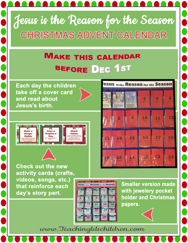
- I wanted to create a flyer that I could post on Facebook that would inspire people to make an advent calendar that would help them focus more on Jesus during the Christmas season.
- I wanted a Christmas theme for the flyer, so I used Christmas paper and covered it with green rectangles except around the edges.
- I wanted to encourage people to make the calendar before Dec 1, so I used Arial Black and set off the date with a contrasting color.
- I used photos I took of two different versions of the calendar that I had made. I used arrows to connect the descriptions with the images.
- I aligned the descriptions and images right and left for a clean look. I also put the matching descriptions and image in close proximity of each other.
- The design is meant for a viewer's eyes to go from the top most important parts and then work their way down. The curve in the date words is meant to point to the next section and also look like garland.
- I used two different fonts for contrast. The name of the script font is Cookie, and so I made a Christmas treat theme with candy cane colors.
- I kept the complimentary color scheme throughout the flyer.
Photoshop:
- I used a hue/saturation adjustment layer on the background Christmas paper to make the colors lighter.
- I used strokes on the rectangles and the images to make them stand out.
- I used the custom shape tool to make the arrows that connected the words with the images they go with.
- I used the pen tool to outline and select the two calendars, and then I made a mask for each calendar.
Font and Graphics:
- I used the Cookie font from 1001 Fonts for the top and bottom words. http://www.1001fonts.com/cookie-font.html
- All other words are in Arial or Arial Black.
- The background Christmas dot paper is from Freepik. <a href='https://www.freepik.com/free-vector/pack-of-christmas-rhombus-patterns_1384615.htm'>Designed by Freepik</a>
