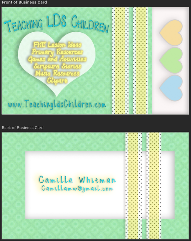
Photoshop:
- I used the new fill or adjustment layer tool at the bottom of the layers box and added a pattern background. I also added an aqua-blue color layer on top of it with 55% opacity to make the background a blueish green.
- I created two rectangle stripes with two layers each. The bottom layer is a white a polka dot pattern and the top thinner layer is yellow with 35% opacity so the underneath polka dots can be seen. I also added a drop shadow so the stripes would appear to have depth.
- I created a white rectangle on the side of the card that has an inner shadow. I added colored hearts from Emojione and flipped them sideways. I added a grey stroke and drop shadow to give them more depth. I used the multiply blend mode and 55% opacity on the hearts to make them match the pastel colors in the card.
- The title and website address uses the font Addis Ababa and is a light blue color. The title is curved and the letters are stretched down 131% and compacted to 94%. It has a black inner shadow and two drop shadows, one blue and one black, to give it more depth and help it to stand out more. The website address is done in the same manner except it is straight and not curved, and the letters are stretched down 143%. The letters and words are also compressed and stretched from side to side to make them fit and make them more readable.
- The large heart was created with the custom shape tool. It was transformed to fit beneath the website resources list. It has a drop shadow to give it depth. The words inside the heart have two layers to give them a puffy look because the yellow didn't stand out enough. Both layers have a yellow stroke because the font was too thin. They both also have a black and yellow drop shadow to give them more depth.
- The back of the business card has the same background and yellow stripes. I also carried over the white box with the inner shadow and tucked it under the stripes. I put my name and email address in the same text and color as the front of the card with a bevel and emboss to make it pop a little more. It also has a yellow and black drop shadow to bring in the yellow color from the front.
Design Thoughts:
I write a blog called Teaching LDS Children, so I wanted to make a business card for my blog.
I write a blog called Teaching LDS Children, so I wanted to make a business card for my blog.
- Colors and Patterns: I used a pastel green pattern for the background because green "represents beginnings and growth" and it "incorporates some of the energy of yellow" (Color Theory for Designers, Part 1: The Meaning of Color by Cameron Chapman) The color and pattern seemed to fit well with the children theme. I also used polka dot stripes and hearts, which also seemed to fit the children theme. I continued the green theme by using the blue and yellow colors for the decorations and lettering which are the primary colors which green is made of.
- Alignment: I did a center alignment for all the wording, which creates consistency.
- Contrast: The white sections created nice background contrast for the colored items in the card. The large lettering and decorative parts also created contrast.
- Proximity: The list of what can be found on the website are grouped together so the reader knows they are related.
- Font: The decorative font "Addis Ababa" was chosen also to fit the child theme.
Font and Background Pattern:
- The green background pattern is from https://www.brusheezy.com/patterns/12472-green-ornamental-pattern
- The font "Addis Ababa" is from https://www.1001freefonts.com/search.php?q=Addis+Ababa&search=search
